


Introduction
With the growing use of smartphones, many Web surveys are now being designed so that they can be administered through smartphones. Such a survey questionnaire is often called a mobile survey. Designing a mobile survey requires usability engineering. A poorly designed user interface for a mobile survey may increase the burden on a survey respondent, frustrate the respondent, and introduce measurement error. Therefore, optimizing the design of a mobile survey is imperative.
A survey question is comprised of some or all of five parts: Pre-question instructions, question, post-question instructions, response options, and post-response option instructions. Since these five parts are presented on a smartphone screen in text, it is crucial for the respondent to correctly perceive each of them and to process the information efficiently. For example, a post-question instruction should not be mistaken for part of the question. Thus, it raises the question: How can the visual design of a mobile survey question facilitate respondents’ reading and responding to the question?
Typographic cueing uses typographic features such as font style (e.g., italics) to reveal content structure, which can facilitate chunking, queuing, and filtering of the content; assist scanning, information prioritization; and allow for faster identification of relevant information (Keyes 1993). There is a body of literature in the field of education which has found that typographic cueing in instructional textbook design is an effective means to improve comprehension and learning through better organization of text information and enhanced recall of important information (Foster 1979; Foster and Coles 1977; Hershberger and Terry 1965; Stewart 1988; Wilson 1981). More recent studies have also investigated the effects of various typographic cues on perceived and actual recall performance (Price, McElroy, and Martin 2016) and second language learning (LaBrozzi 2016; Simard 2009). In Price et al.'s study (2016), participants were shown 120 pairs of words, in two blocks of 60 pairs each. The words appeared in various font sizes and styles (normal, bold, italics). For each block, the participants were asked to report their perceived ability to recall each word pair immediately after seeing them, followed by completing a cued recall test. The results of this experiment showed that various typographic cues were perceived as facilitating recall. Typographic cues were also found to enhance critical learning aspects of second language acquisition by improving the intake of plural markers in children (Simard 2009). Specifically, having more than one typographic cue or capital letters alone led to better intake. Similar results were found in adults (LaBrozzi 2016), with form recognition and comprehension being improved by larger font sizes, while no detriment to performance was observed for any type of typographic cueing.
In survey design, typographic cueing is often used to differentiate the question, instructions, and response options. It is suggested that font cues take advantage of the Gestalt principle of similarity that makes it easier for respondents to mentally group survey question content (Smyth et al. 2006). Dillman (2011) proposed a set of guidelines for survey design based on psychological principles that promote this practice. Specifically, these guidelines recommend that the question be darker than the response option text to draw attention to the question first for each item. In addition, guidelines recommend that italics be used to distinguish instructional text, that some respondents may already know, from the rest of the question to allow for skipping or skimming of this information. It is suggested that these typographic cues would lead to faster completion of the survey and improve the quality of survey responses. While the guidelines appear theoretically sound, few empirical studies have been published on the application of typographic cuing in mobile surveys. An unpublished dissertation (Redline 2011) tested typographic cueing effects on a Web survey and found that italicizing instructional text did not affect response accuracy or survey completion rates. However, Redline’s study was focused on Web surveys that were completed on the large screens of desktop or laptop computers, not on smaller and handheld electronic devices.
The present study investigated the use of typographic cueing to visually differentiate a question from an instruction in a survey question item presented on the screen of a smartphone. The experiment was designed to address three questions: Does bolding the question improve response efficiency and improve respondent satisfaction? Does italicizing instructions improve response efficiency and respondent satisfaction? If so, is this due to increased skimming or skipping of text that is deemed by the respondent to be irrelevant?
Older adults were chosen as participants for this study because poor mobile survey design would more likely impact this population than younger adults. Typically, older adults have less experience with new technologies, and have lower cognitive and physical abilities compared with younger adults. A design that is suitable for older adults would be at least workable with the younger population, who generally have better perceptual and motor capabilities than their older counterparts (Basak et al. 2008).
Methods
Participants
Thirty participants (9 males and 21 females), aged 60–80 years (mean = 69.8 years), were recruited from senior centers in the Washington, D.C. metropolitan area. Participants had at least 12 months of experience in using a smartphone to ensure that the potential respondent sample in this study may be considered comparable to respondents who could complete a Web survey on a smartphone. In addition, they had an education of eighth grade or more, were fluent in English, and had normal habitual vision (the vision which the participant presented at the experimental session). All participants provided written informed consent to take part in this study. The participants were given a small honorarium for participating in the study.
Experimental Design
The study was a between-subjects 2x2 factorial design. The factors of interest were the use of bolding for questions (Bold) and the use of italics for instructional text (Italics). The factor Bold had two levels, bold versus plain text. At the bold level, the question was displayed in bold style, while at the plain text level, the question was not bolded. The factor Italics had two levels, italicized versus plain text. At the italicized level, instructions were displayed in italicized style, while at the plain text level, instruction were not italicized. The combination of the two factors resulted in four possible typographic design conditions, with an example shown in Figure 1: bolded question and italicized instructions, bolded question and plain text instructions, plain text question and italicized instructions, and all plain text. Participants were randomly assigned to each condition, such that seven or eight participants were in one condition, with 15 participants at each level of a factor.

Procedure
The participant completed a 5-question survey on an iPhone 5s in the assigned condition. The participant was instructed to answer the questions as they pertain to themselves as quickly and accurately as possible. The survey questions were selected from government surveys and consisted of various amounts of text. The questions used in the survey are shown in Table 1.
After completing the survey, the participant performed a word recognition test, which will be explained in more detail in the “Skimming vs. Skipping Text” section. The participant then completed the satisfaction questionnaire. Finally, the participant was shown the images of all four designs and asked to choose their most preferred design.
Performance Measures
Participants’ performance of completing the survey was measured through objective observation and subjective self-reporting. We were specifically focused on efficiency and satisfaction. Efficiency was assessed with survey completion time (SCTime). SCTime was defined as the duration (in seconds) between the appearance of the first survey question screen and the completion of the last question in the survey. Satisfaction was assessed through a 5-point rating scale of task difficulty with ‘1’ being very easy and ‘5’ being very difficult, and self-reporting of overall preference of the four designs.
Skimming versus Skipping Text
A word recognition test was conducted to assess participants’ attention in reading survey content and to determine whether any differences found in SCTime were due to skipping or skimming of the content. A list of 20 words was given to the participant immediately after completing the survey. The list contained 11 “old” words and nine “new” words. The “old” words were those that had appeared in the survey questions, while the “new” words were similar to the “old” words but had not appeared in the survey questions. Participants were asked to circle as many words as they remembered seeing in the five survey questions. A corrected recognition score (hit rate minus false alarm rate) was calculated to serve as an indicator to how attentively the participant read the survey content. The corrected recognition score penalizes guessing behavior and is widely used in recognition memory research (Anastasi and Rhodes 2005; Corwin 1994; Snodgrass and Corwin 1988). If the respondent paid less attention to the instructional content while responding to the survey questions, one can expect a lower recognition score for “old” words. A skimming strategy can also be expected to have a less detrimental effect on recognition scores than if the text was skipped entirely.
Analysis
Survey Completion Time. A two-way analysis of variance (ANOVA) was performed on SCTime to determine whether there was a significant main effect for Bold, a main effect for Italics, or an effect of the interaction between the two factors.
Satisfaction. Difficulty ratings were analyzed using multinomial logistic regression for the two factors of Bold and Italics. Overall preference was analyzed using a one-way chi-square test for the four designs.
Word recognition. The corrected recognition score was defined as hit rate minus false alarm rate in word recognition. For each participant, hit rate was calculated by dividing the number of recognized “old” words by the total number of “old” words, while false alarm rate was calculated by dividing the number of falsely recognized words by the total number of “new” words. The corrected recognition score was then calculated for each participant by subtracting the false alarm rate from the hit rate. Finally, a two-way ANOVA for the two factors of Bold and Italics was conducted to analyze the corrected recognition scores.
A p-value of 0.05 was used as the significance threshold for all analyses.
Results
Effects of Typographic Cueing on Survey Completion Time
The results of the two-way ANOVA found a statistically significant main effect for Italics (F[1,26] = 4.90, p = .03), but not for Bold (F[1,26] = 0.04, p = .84), on SCTime. The interaction effect was not significant (F[1,26] = 0.00, p = .94). As Figure 2 shows, SCTime in both survey design conditions containing italicized instructions was substantially shorter than the other two conditions containing plain text instructions. On average, SCTime was about 17 seconds (28%) shorter in the italicized instruction conditions (44±18 sec) than the plain text instruction conditions (62±23 sec), across bold and plain text question designs.

Effects of Typographic Cueing on Difficulty Rating
We conducted a multinomial logistic regression predicting difficulty rating from Italics and Bold. Results show no statistically significant effect of Italics or Bold, nor their interaction, on difficulty rating (p > .05). On the 5-point ordinal scale with 1 being the lowest difficulty level, participants rated the task as easy overall, with 86% scoring 1, 10% 2, and 3.3% 3.
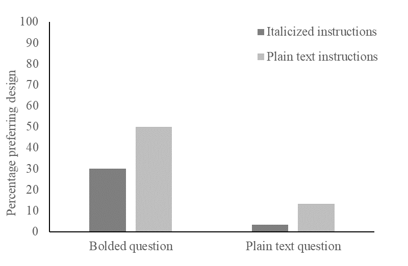
Overall Preference
A chi-square test showed that the number of participants that preferred one design over the rest differed significantly (χ2(3) = 14.03, p = .002). As can be seen in Figure 3, 83% of participants preferred the mobile surveys designed with bolded questions regardless of instruction style, and 52% preferred the design with the combination of bolded questions and plain text instructions.
.png)
Effects of Typographic Cueing on Recognition Memory
The results of the two-way ANOVA did not reveal a significant main effect for bolded questions (F[1, 26] = 0.26, p = .61), nor for italicized instructions (F[1,26] = 0.97, p = .33) on corrected recognition score. The interaction effect was also not significant (F[1,26] = 0.01, p = .91). The mean score across all conditions was 31% (SD = 36%). Figure 4 shows the mean corrected recognition scores of the different design conditions.

Discussion
The present study investigated whether bolding of the question and italicizing of instructions facilitates completion of mobile surveys when taken by older adults. The results of this study show that italicized instructions result in shorter SCTime with no loss of information about question content. We also find that surveys designed with bolded questions are highly preferred by participants, even though bolding questions does not improve survey accuracy or efficiency.
SCTime for mobile survey designs that included italicized instructions was on average 17 seconds shorter than the designs that use plain text instructions. The practical implications for this time benefit, observed on a short 5-question survey, could be substantial in longer surveys with more questions. Some major surveys may take at least 15 minutes or so to complete, and completing surveys on mobile devices has been shown to increase survey completion time due to the smaller screen size (Couper and Peterson 2017). Therefore, a decrease in completion time such as that observed in this study could significantly reduce the burden on respondents and, in turn, improve response rates (Fan and Yan 2010). We designed a short survey with the rationale that it is more difficult to detect a design benefit in a shorter, rather than longer, survey. If a design benefit is observed in a shorter survey, such benefit will most likely be amplified in a longer survey.
We used word recognition as a means to assess whether parts of the survey question text were being attended to more or less across design conditions. The purpose of this test was to determine whether differences in SCTime were attributed to content filtering from the use of typographic cues (Keyes 1993). Dillman (2011) suggested that by using italics or another visual cue to separate known or seldom used instructions from the rest of the question, respondents will be able to skim or skip this text without negative consequences. Our findings support Dillman’s (2011) hypothesis, as we observed in this experiment shorter SCTime for the conditions with italicized instructions, and no significant difference in correct word recognition scores between designs. This finding suggests that participants engage a similar amount of attentional resources in all four conditions, yet complete the survey faster in the italics condition. Given that no significant difference was found between design conditions in the amount of text that was read in the presence of a time benefit, and that the amount of text being read was relatively small as indicated by the corrected recognition score (31%), we argue that participants are more likely skipping rather than skimming instructional text.
Another major finding from this study is that the mobile surveys designed with bolded questions are highly preferred by participants. When asked why they reported their preferences as such, the most popular response was that bolded questions were simply “easy to read.” Given the older age group of the participants in this study, such a comment is not surprising. However, while bolded questions are strongly preferred, they do not appear to improve response quality. We believe this is due to the use of a paging design (i.e., only one survey question is presented on one page) for this experiment. The benefit of bolding questions as suggested by Dillman (2011) is to easily find the beginning of each survey question. While paging designs are a common practice for mobile surveys, the benefits of bolding the question in paging design may have diminished because the start of each survey question is always at the top of the page and easy to spot. Another survey design for mobile devices uses scrolling where multiple questions reside on one page. For such a design, bolded questions may be more helpful for directing a respondent’s attention to the start of each subsequent question as a respondent scrolls down the page and consequently could shorten completion time. This hypothesis shall be tested in a future study.
In this study, the iPhone 5s was used as a data collection instrument for the following reasons. First, due to a limited budget, the experiment’s mobile app was developed only on the iOS platform. Second, the iPhone 5s was the model available at the time when data collection took place. Third, the interest of the present study was user interface design on a small screen. Therefore, the type of smartphone product is not important because the participant would interact with the same user interface regardless of the phone product.
This experiment was designed with a sample size of 30 participants, based on the general rule of thumb in statistics that 30 data elements are considered a large enough sample in laboratory-based behavioral studies, which usually have smaller dispersion in data distribution than survey data. To increase statistical power, we employed a factorial ANOVA, which allowed us to collapse data across participants to increase data points by assessing the main effects of italics and bold rather than the specific effects of the four design conditions. Since this is the first study of this kind, there was no existing effect size that could be used to estimate power for the sample size. The results of the present study can be used for power estimations in future studies.
One limitation of the present study is that the sample included only older adults. This experiment was conducted on older adults based on the assumption that an improvement in survey completion performance resulting from typographic cueing in older adults would also be applicable to the younger population, but not vice versa. There are evidences showing better perceptual and motor capabilities in the younger population compared to their older counterparts (e.g., Basak et al. 2008). Due to the constraints on recruitment, we encountered more female volunteers than males during data collection. We compared mean SCTime between males and females and found no statistically significant differences (p = 0.71). A more gender-balanced sample is desirable for future studies, to further characterize gender differences.
In conclusion, the present study provides empirical evidences supporting the survey design of italicizing instructions to improve survey completion efficiency. In addition, bolded questions are preferred, though a behavioral benefit may not be apparent.
Acknowledgment
We thank MetroStar Systems for developing the experimental software used in this experiment, Mr. Russel Sanders for managing the project under which this research was carried out, Mr. Sabin Lakhe and Mr. Lawrence Malakhoff for technical support, and Mr. Kevin Younes for recruitment assistance.
Disclaimer
The views expressed are those of the authors and not necessarily those of the U.S. Census Bureau, Northrop Grumman, University of Maryland, or George Mason University.