Introduction
Grid questions are often used to save space in surveys. While the decision to use grids may be justified in certain situations, the survey literature includes a number of examples of negative data quality outcomes resulting from the use of grids (e.g., Toepoel et al. 2009; Tourangeau et al. 2004). This is especially true in recent years, as the percentage of surveys taken on smartphones is rising (Link et al. 2014), and grids display poorly on small screens. These types of challenges when presenting grids on smartphones have left researchers looking for alternate solutions. In this paper, we introduce a “stacked” format that presents each row of a grid separately for smartphone screens. To determine if people respond differently to the small screen’s stacked grid compared to the large screen’s nonstacked (i.e., traditional) grid, we compare outcomes and indicators of data quality between the two versions.
Background and Literature
A benefit of grids is they save space by avoiding repetition. However, the literature suggests grids can have a number of drawbacks. Completing a grid is cognitively challenging (Dillman, Smyth, and Christian 2014), and the task is even more complicated when horizontal or vertical scrolling is required to view the entire grid. An additional drawback of grids is that they tend to result in faster survey completion times (e.g., Couper et al. 2013), which may increase measurement error (Peytchev 2005).
However, many of the findings on grids are mixed. Some studies find higher inter-item correlations (straight-lining) in grids (e.g., Toepoel et al. 2009), while others find no difference (e.g., Callegaro et al. 2009). Furthermore, some studies suggest rates of missing data may be higher in grids (e.g., Toepoel et al. 2009), while others find the opposite (Couper, Traugott, and Lamais 2001).
Dillman and colleagues (2014) suggest presenting grid items as a series of individual questions when mobile responses are anticipated. This is especially critical because of continuously rising rates of smartphone and tablet use – currently 68 percent of U.S. adults have a smartphone and 45 percent have a tablet (Pew Research Center 2015). This increase correlates with a rise in survey participation via mobile devices (Link et al. 2014). Nearly every web survey today includes mobile respondents, and the design of surveys must acknowledge and accommodate users of these devices.
Despite recommendations to avoid grids, sometimes their use is justified. It may be important to retain grids in longitudinal studies that have used grids previously or in mail surveys with page constraints. For this web and mail survey, we attempted to optimize grid display on mobile devices, so the decision to use grids would not automatically sacrifice comparability across devices (e.g., smartphone vs. desktop) or modes (i.e., web vs. mail).
Methods
In this paper, we compare traditional and mobile-optimized grid formats on the World Trade Center (WTC) Health Registry’s 2015 health survey. The WTC Health Registry was established in 2002 to monitor the long-term physical and mental health of people exposed to the September 11, 2001 terrorist attack on the WTC in New York City, and to better assess the post-disaster health care needs of survivors (Brackbill et al. 2009; Farfel et al. 2008).
Four waves of the survey have taken place since the WTC Health Registry was created in 2002. The fourth wave was launched in early April 2015. It offered two modes: web and mail. This paper presents findings based on 14,613 web responses that were received through August 2015 before nonresponse follow-up efforts began.
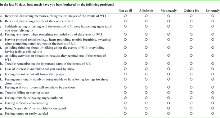
This survey contained five grids[1] to assess: (1) health condition diagnoses, (2) post-traumatic stress disorder (PTSD) symptoms, (3) depression symptoms, (4) psychological distress symptoms, and (5) availability of social support. We used grids in the survey to maintain the original format of validated scales. Furthermore, grids were the most practical format – particularly in the mail mode, which had page constraints – and we wanted to ensure comparability across modes of the survey, as well as to previous waves of the survey, which used grids. We anticipated that this wave would have a greater number of mobile respondents than earlier waves, so we optimized the display of grids to account for the respondent’s screen size.
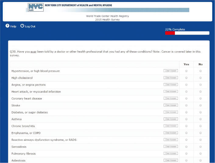
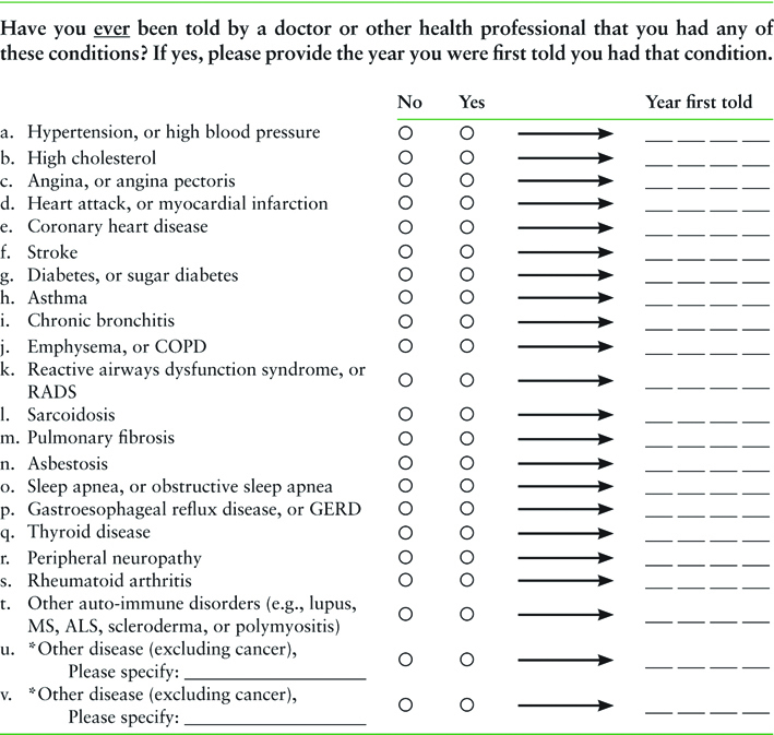
The survey was programmed to modify the display of grid questions based on the respondent’s screen width. For devices whose width was greater than 760 pixels (the approximate width of a phone in landscape mode), grid questions were rendered in a traditional grid format (Figure 1). For smaller-width devices (smartphones or small tablets), grids were rendered in a “stacked format” that presented each row separately (Figure 2). The stacked format improves the display on small screens by eliminating the need for horizontal scrolling. We investigated if and how data quality differed between the traditional and stacked versions of the grids by examining three measures of data quality: (1) mean responses across the items, (2) missing data, and (3) straight-lining.
Analysis
As we could not randomly assign respondents to a device, we needed to account for the respondent differences due to self-selection in the analysis. Although there are multiple methods to accomplish this, we chose to control for respondents’ characteristics in regression models as it is a well-established, robust statistical method. Specifically, we analyze the data through predicted probabilities from logistic and ordinary least squares regression models.
Since this survey is longitudinal, we can also account for the lack of experimental design by comparing the results in the current survey (Wave 4 – mobile optimized) to the results in the previous wave. We compared across waves responses to the health conditions grid, because this was the only grid with a lifetime reference period.
Results
Demographics
Out of the 14,613 web respondents, 11 percent completed the survey on a small device such as a smartphone. Smartphone respondents were statistically younger and less educated than larger screen respondents. Due to these demographic differences, we control for age, education, and gender when analyzing the differences in responses across the two grid formats.
Response Differences
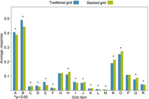
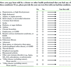
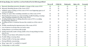
We began by comparing response distributions for grid items across formats (traditional vs. stacked). These grids were all ordered from positive to negative, with fewer symptoms on the left and more on the right.[2] For four of the grids, respondents who viewed the stacked format selected on average more “negative” responses than those viewing the traditional format, meaning they reported having fewer sources of social support and more symptoms of PTSD, depression, and psychological distress. For every item in these grids, the response differences across formats followed the same pattern of the stacked format resulting in more negative selections. Figure 3 displays this pattern for the PTSD grid; the depression, psychological distress, and social support grids demonstrate the same pattern and are available upon request. There was no clear pattern in the remaining grid, which asks about health conditions with which the respondent has ever been diagnosed (see Figure 4).
Data Quality
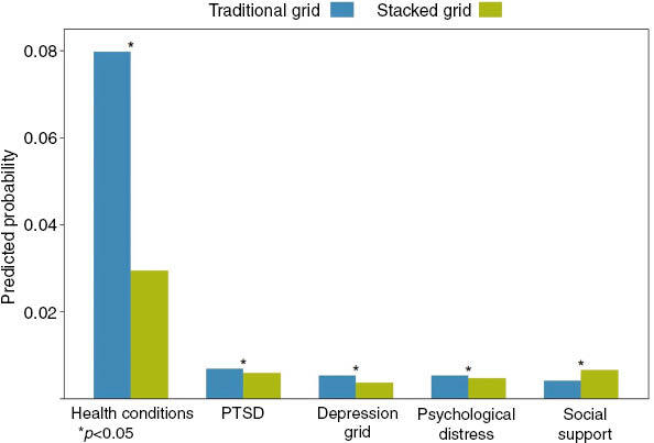
We examined rates of missing data and straight-lining to get an indication of data quality in the traditional vs. stacked formats. In all but the social support grid, the predicted probability that respondents would leave at least one item unanswered is significantly higher in the traditional grid compared to the stacked grid. These differences were statistically significant. Figure 5 compares the predicted probabilities of respondents missing an item for each grid by grid format.
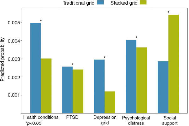
The predicted probability that respondents would skip an entire grid followed the same pattern: skipping an entire grid was more likely among those viewing the traditional grid, and this was true for all grids except social support (see Figure 6). Skipping an entire grid was rare, with predicted probabilities ranging from 0.0025 to only 0.0047.
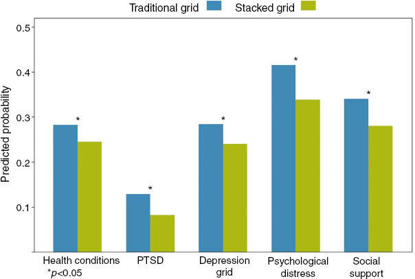
Next, we looked at straight-lining to see if one of the grid formats was more likely to result in respondents selecting the same response option for all items in a grid. In all five grids, respondents were significantly more likely to straight-line when presented with the traditional format compared to the stacked format (p<0.05; see Figure 7).
Differences Over Time
Finally, we compared the health conditions reported during the current and previous waves to determine if the stacked format affected accuracy. We gauged accuracy as the absence of discrepancies across the two waves, using only conditions reported as having a diagnosis year of 2010 or earlier, as these conditions should have been reported in both waves. Overall, respondents had an average of 1.6 discrepancies, meaning they reported these conditions in only one wave instead of in both waves. However, the number of discrepancies per respondent was not statistically different across the two grid formats.
Summary and Discussion
Four of the five grids had a clear trend of more negative responses being selected in the stacked format. These grids were similar in structure (4–5 response options) and topic (psychological symptoms). It is not surprising that these grids showed a response pattern that the health conditions grid did not, because these grids are scales and we would expect respondents to select similar responses across items within each grid.
For the health conditions grid, the probability of respondents skipping items in the stacked format was less than half of that for the traditional grid format. We speculate the following may have contributed to the higher rate of item missingness in the traditional format:
- At 22 items, the grid’s length may be perceived as intimidating and burdensome, particularly when all items are visible as they are on a large screen (traditional format).
- The stacked format breaks out items so they are viewed individually, making it less likely respondents will skip an item (i.e., row in the grid) without realizing it.
- Some respondents may have treated the forced choice yes/no format in the health conditions grid as though it were a checkbox format (i.e., they may have left items blank rather than selecting “No”).
The likelihood of skipping an entire grid by format varied across grids. Respondents who viewed the stacked format were significantly more likely to skip the entire social support grid, while those viewing the traditional grid were significantly more likely to skip the other grids. The social support grid appears late in the survey, so fatigue among mobile respondents may have driven the difference between the traditional and stacked versions of this grid.
We found that straight-lining was significantly more likely across all grids in the traditional format than the stacked format. This suggests that straight-lining can be reduced by forcing respondents to consider each item individually, as is done in the stacked format. Although these data quality measures are statistically significant, it is important to note that the impact of some measures (e.g., straight-lining) may be greater than the impact of others with lower predicted probabilities (e.g., skipping an entire grid).
We found that the inconsistences between the current and previous waves were roughly equally common in both the traditional and stacked grid formats. One format did not appear to elicit more consistent responses.
A limitation of our approach is that we were unable to randomly assign sample members to the stacked (mobile) and traditional (nonmobile) versions of the grids. As a result, we do not know to what extent observed differences are due to layout or device vs. characteristics of respondents using each type of device.
We know that grids have both advantages (e.g., space efficiency, faster completion time) and disadvantages (e.g., straight-lining, missing data, cognitive challenge). As this was the fourth wave of the survey, we determined the need to make longitudinal comparisons to earlier grids outweighed the disadvantages of using grids. However, in earlier waves of the survey, smartphones were much less prevalent and we assume mobile responding was uncommon, so the issue of grids displaying poorly on smartphones was less of a concern.
Given that there will be respondents who respond via smartphone, researchers should use a grid format that works on small screens, while maintaining compatibility with the traditional grid to reduce mode effects. We recommend using the stacked format, as it (1) presents items in a grid-like fashion but formats them for optimal mobile usability and (2) has no consistent evidence of decreased data quality, and in fact, we found evidence of slightly increased data quality in some circumstances. Data quality is an important consideration above and beyond space efficiency and survey administration time. The benefits we observed with the stacked version of the grid may even suggest that some variant of the stacked format should be considered for all devices, regardless of screen size.
Appendix
In the Appendix, we present exact question wording and visual structure of the questions in Figures 8–12.
From left to right, response options were ordered from positive to negative and ranged from “not at all” (score of 1) to “extremely,” (score of 5) or “none of the time” (score of 1) to “all of the time” (score of 5). The social support grid was opposite in that from left to right its order was negative to positive, i.e., “not at all” to “nearly every day.” To maintain consistency across the grids, the social support scale was reversed in the analysis so that “nearly every day” was a score of 1 and “not at all” was a score of 5.


