

Introduction
While researchers tend to agree on many aspects of Web survey design, there is still great ambiguity on how best to present navigation buttons. Some argue that Next should be on the left side of the screen and Previous should be on the right because it reduces the amount of time taken to move the cursor to the primary action button (Couper 2008), Next comes first in tab order (Crawford, McCabe, and Pope 2005), and Next is used more frequently and should be the first option a user sees (Dillman, Smyth, and Christian 2009; Faulkner 1998; Koyani et al. 2004). However, Romano and Chen (2010, 2011) found in lab-based studies that when Previous was on the right and Next was on the left, participants first moved their cursor near Previous before bringing the cursor over to Next to make the click – they also explicitly commented that the location of Next and Previous was counterintuitive, and they gave low ratings to a satisfaction questionnaire item regarding arrangement of necessary information on the screen. Some argue that Previous should be on the left and Next should be on the right because many Web applications (e.g., e-mail) and browsers (e.g., Firefox, Internet Explorer) follow this order, this configuration is used in many everyday devices (e.g., remote controls, telephones), and it follows logical reading order (e.g., turning pages in a book). Still others argue for Previous to be below the Next button because it follows the tab order and allows the buttons to be presented close together (Couper, Baker, and Mechling 2011).
We conducted a qualitative lab-based experimental usability study in which we manipulated the placement of the Next and Previous buttons. In addition to assessing the relationship between placement of navigation buttons and ability to progress through the survey, our lab-based design enabled us to directly observe user interactions, listen to their thoughts, and ask specific questions related to their performance or the interface. We also used noninvasive eye tracking (collected while participants completed the survey) to better understand which design features captured participants’ attention as well as those they failed to notice. This method allowed us to ask the following questions: (1) Does primary navigation button placement impact respondent satisfaction? Specifically, are respondents more satisfied when Next is on the left or right side of the screen? (2) Do respondents make more negative comments when Next is on the right or left side of the screen? (3) How long does it take respondents to see the Next button? (4) Do respondents learn where to look for the primary navigation button as they progress through a survey? We hypothesized that participants would be more satisfied when Next was on the right and that participants would make more negative comments when Next was on the left. We also hypothesized that participants would look at the right navigation button before the left button and that they would learn where to look for the primary navigation button as they progressed.
Method
We created a survey similar to the one used in previous studies (Romano and Chen 2010, 2011) except that there were no skip patterns. The Next and Previous buttons were on opposite sides of the screen in both versions, the “NP” version where Next was on the left and Previous was on the right, and the “PN” version where Previous was on the left and Next was on the right. We also conducted eye tracking to assess which navigation button participants looked at first and if they learned where to look as they progressed through the survey.
Participants. Forty-one people (19 males, 22 females), with a mean age of 42 years (range: 21–69 years), participated in the study. All participants were US Census Bureau employees and were recruited from a broadcast e-mail announcement that went to all Census Bureau employees and contractors. All participants reported having at least one year of Internet experience and knowledge of how to navigate a Web site. None were in usability-related professions, and none had prior knowledge about the study or survey. See Table 1 for participants’ self-reported demographics.
Procedure. Testing took place in the Human Factors and Usability Research Group’s laboratory at the US Census Bureau headquarters. Each participant sat individually in a 10′ 12′ room, facing a one-way mirror and a wall camera, in front of a 17″ LCD Tobii T-120 eye-tracking monitor. Eye tracking was noninvasive and did not constrain normal head movements; consequently, participants could move freely in a limited area. During the sessions, the moderator sat in the control room on the other side of the one-way mirror. The moderator and participant communicated via microphones and speakers.
Participants were randomly assigned to a condition. The moderator was blind to the condition up until the session when he had to load the survey for the participant. Seventeen participants received the PN version, and 24 participants received the NP version.
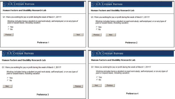
Participants were asked to complete the survey as if they were at home, and upon completion, they completed a satisfaction questionnaire (items shown in Table 2). The moderator then probed specifically about the placement of the Next and Previous buttons by showing the participant four versions of a screen with various placements of the Next and Previous buttons and asked which one he or she preferred. In the first version, Previous was on the far left and Next was on the far right of the screen; in the second version, Previous and Next were closer together; in the third version, Next was on the far left and Previous was on the far right; and in the fourth version, Next and Previous were closer together. See Figure 1 (Note: Versions 1 and 3 were used in the experimental portion of the study).

Results and Discussion
Efficiency. The average time it took participants to complete the survey was 6 min 19 s. A one-way ANOVA showed no significant difference in time to complete the survey across the two conditions (M=6.5, SD=2.3; M=5.8, SD=1.3, PN and NP groups, respectively).[1]
User satisfaction. The average satisfaction rating across all participants was 7.09 out of 9 (1=low and 9=high), suggesting that participants were satisfied with the survey, overall. Consistent with our hypothesis, participants in the PN group rated the placement of the navigation buttons (illogical-logical) significantly higher than participants in the NP condition, F (1, 39)=13.54, p<0.001, reffect=0.51. The means across participants for all satisfaction items are shown in Table 2.
Preference. Upon completion of the survey and the satisfaction questionnaire, the moderator showed participants four screens (Figure 1) and asked them to choose the one they preferred. The only difference among the screens was the placement of the Next and Previous buttons. Thirty-nine of the 41 participants said they preferred Versions 1 or 2, in which Next was to the right of Previous (31 of those participants said they preferred the buttons closer together, as shown in Version 2 in Figure 1). Two participants said they preferred Version 4, in which Next was to the left of Previous, and the buttons were close together, and no participants said they preferred Version 3, in which Next was to the left of Previous, and the buttons were far apart.
The number of negative comments participants made about the placement of the navigation buttons during the survey and preference task were aggregated. Participants in the NP group made significantly more negative comments about the navigation buttons than the PN group, t (39)=2.93, p<0.01 reffect=0.42, d=0.94. Many participants said that it was illogical to have Previous on the right. One participant in the NP condition said that, “the Next button was on the opposite side of the screen from where I expected it.” Another said, “The placement of the Next and Previous buttons did not make sense to me even though I did not have to move my mouse as far to get to the Next button,” and another said that “almost all the other surveys I’ve completed have Next on the right and Previous on the left…it’s like reading a book.”
We aggregated the number of positive comments made about the placement of Next and Previous and found that participants in the PN group made significantly more positive comments about the navigation buttons than the NP group, t (39)=5.50, p<0.0001, reffect =0.66, d=1.76. For the PN version, participants said, “the buttons were in the right place,” “where they normally would be on an Internet form,” and that they “made sense.” Another said that the buttons were “logical, visible and accessible.”
Eye tracking. We uniquely defined the Next button and the Previous button as Areas of Interest (AOIs) and examined fixation patterns and time to first fixate those areas.[2] In both the NP and PN versions, participants looked at the Next and Previous buttons on the first screen. We conducted a paired t-test comparing total fixations on the Next and Previous buttons across both groups, and we found that participants in both groups looked at Next more than Previous, t (38)=3.68, p<0.001, reffect=0.51, d=1.19.
On the first page of the survey that had both navigation buttons present (shown in Figure 2), we calculated time to first fixate the Next and Previous buttons; time began when the page loaded. Participants looked at the question and response options and then at the navigation buttons. In a paired t-test comparing time to first fixate Next and Previous, across both groups, there was no difference in time to first fixate the navigation buttons, t (24)=1.24, p=0.23, reffect=0.25, d=0.51. When split by condition, participants in the PN condition looked at Previous first: on average, they took 9.88 (SD=5.67) seconds to first fixate Next and 7.42 (SD=4.60) seconds to fixate Previous, t (11)=2.03, p=0.07, reffect=0.52, d=1.23. There was no difference in time to first fixate Next and Previous for participants in the NP condition: they took 7.73 (SD=3.26) seconds on average to fixate Next and 8.26 (SD=3.01) seconds to fixate Previous, t (12)=0.94, p=0.37, reffect=0.26, d=0.54. Across both conditions, there was no difference in time to first fixate Next whether it was on the left or right, F (1, 34)=1.87, p=0.18, reffect=0.23, d=0.44, nor was there a difference in time to first fixate Previous, F (1, 26)=0.33, p=0.57, reffect=0.11, d=0.19. We collapsed navigation button type across location to determine whether people look at a certain side of the screen (left or right) first. In a paired _t-_test, we found that participants looked at the left button (mean=7.59 s, SD=3.85) sooner than the right button (mean=9.19 s, SD=4.74), t (24)=2.19, p<0.05, reffect=0.41, d=0.89, regardless of whether it was Next or Previous.
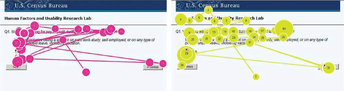
Figure 2 displays representative eye-tracking gaze plots for a participant in the NP version and a participant in the PN version of the survey. The survey item shown in the figure is the first item that participants encountered at the beginning of the session (asking if the respondent was working for pay or profit during the week of March 1, 2011).
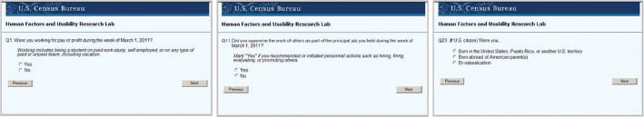
Do people learn where to look? We examined fixation patterns to assess whether people learned where to look for the navigation buttons as they progressed through the survey. We selected three screens that were similar to each other (in the type and length of question and in responses displayed on the screen) and were spaced equidistant through the survey (i.e., the beginning, middle, and end). We omitted an introductory screen that had a Start Survey button in the center of the screen and a final screen that had an End Survey button in the center and examined time to first fixate the Next and Previous buttons on pages 1, 11, and 23 of the survey (shown in Figure 3).
Figure 4 displays the time to first fixate the Next button across the survey. While visually it appears that participants in the PN condition took longer than participants in the NP condition to look at Next in the beginning of the survey, as reported earlier, this difference was not statistically significant. Furthermore, the difference dissipates by the end of the survey: by the middle of the survey, only four participants in the PN condition looked at Previous and no participants in the NP condition did; by the end of the survey, none of the participants looked at the Previous button. We also examined the time it took for participants to click on Next, the primary navigation button, after they responded to the survey items on those three screens. A two-way ANOVA comparing time to click on the Next button revealed no significant difference between the groups, F (1, 115)=2.65. p=0.11, but a significant main effect for question number, F (1, 115)=14.74, p<0.0001. These findings demonstrate that people learned where to look for the navigation buttons as they progressed through the survey, regardless of condition.
__in_seconds__to_first_fixate__next__at_the_beginning_(1)__mid.jpg)
Conclusion
Our study leads to four primary conclusions. First, participants were more satisfied when Next was on the right and Previous was on the left – people in the PN condition specifically rated the placement of the navigation buttons as more “logical” than “illogical,” and they made more negative comments about the navigation when Next was on the left and more positive comments when Previous was on the left. Second, most participants said that they preferred the Next button to be to the right of Previous. Third, regardless of the location of the navigation buttons, there was no difference in the time it took participants to complete the survey or to click on the primary navigation button once they made a response. Finally, although participants looked at the left button sooner than the right button and at Next more often the Previous, they learned where the primary navigation button was to navigate forward as they progressed through the survey.
While others have argued that Next is used more frequently and thus should be the first option a user sees (Dillman, Smyth, and Christian 2009; Faulkner 1998; Koyani et al. 2004), our study demonstrates that even though people looked in one place (the left), they preferred a different place (the right). Participants were less satisfied when Next was to the left of Previous – not only did they report lower satisfaction on the satisfaction questionnaire item that asked about the placement of the navigation buttons, but they also reported lower satisfaction on other items (e.g., “Information displayed on the screen: Inadequate – Adequate”), even though the only difference between the two versions was the placement of the Next and Previous buttons. As most drop outs take place at the beginning of an online survey when respondents have not made a final decision to participate, and as motivation plays a role in completion (Reips 2002), satisfaction likely plays a larger role than previously recognized. Therefore, we argue that it does matter where the navigation buttons are located, and specifically, the Next button should be on the right.
Web survey designers should be aware that peoples’ interactions with Web-based products are influenced by their interactions with other daily products such as remote controls, telephones, and books. One of the goals of usability testing is to determine whether a product behaves the way that it is intended for the end user. Designers should not re-invent the wheel or expect users to re-learn their mental models that have taken years of experience to form. Rather, designers should design in ways that make sense to the end user. We often see users grappling with products that may seem logical in their intended use, and yet they do not match users’ mental models, and ultimately, users end up frustrated. As more and more surveys are moving to the Web, it is especially important to decipher the best way to present navigation buttons to respondents.
In conclusion, this is the first study to demonstrate that even though people look at the left button sooner than the right button and favor Next to be to the right of Previous, they learn where the primary navigation button is as they progress through a survey. While ambiguity still remains regarding proper placement of navigation buttons, this study is a small step towards understanding the dynamics of respondents’ preferences.
Author Note
At the time this work was performed, all authors were employees of the US Census Bureau. Jennifer is now at Facebook.
This report is released to inform interested parties of research and to encourage discussion. Any views expressed on the methodological issues are those of the authors and not necessarily those of the US Census Bureau or Facebook.
Acknowledgements
We thank Jon Krosnick, Mick Couper and Temika Holland for helpful feedback on an earlier version of this paper. We also thank Misa Gareau and Brielle Crites for assistance with data entry.
Since time to complete often produces skewed data, we did a log transformation and found that data was not skewed; results were the same.
Six participants (two from the NP condition; four from the PN condition) were omitted from the eye-tracking analyses due to lack of eye-tracking data.