Background
Led by increasing web usage on mobile devices, respondents are spontaneously accessing web questionnaires via their mobile device. In August 2013, about 11 percent of the respondents in the CentERpanel, an online probability panel in the Netherlands, reported to complete the panel’s regular web surveys using tablets, and 2 percent using smartphones. These shares are expected to grow along with the increasing mobile internet penetration. If web surveys are not adapted for mobile browsers, taking a survey using a mobile device is likely to result in suboptimal questionnaire presentation and completion.
A few strategies for handling spontaneous mobile response have been suggested. Callegaro (2010) presents four approaches: blocking the unintended mobile respondents from taking part in the survey, flagging them in the data, developing a mobile questionnaire version for the most common mobile devices, or developing a survey platform that can handle all desktop and mobile devices.
Buskirk and Andrus (2012) refer to passive and active approaches to offering mobile web surveys. The passive way is to allow the respondent to access a web survey using mobile devices but not to modify the layout. The active approach is to reformat and deploy the survey for mobile browsers, applied when the survey is accessed via mobile devices. The latter approach is also referred to as responsive web survey design, which can be applied by detecting the respondent’s browser type based on the automatically logged user agent string as soon as he or she accesses the questionnaire. Depending on the browser type, the respondent is either directed to a regular computer or a mobile version of the questionnaire (see e.g., Boreham and Wijnant 2013).
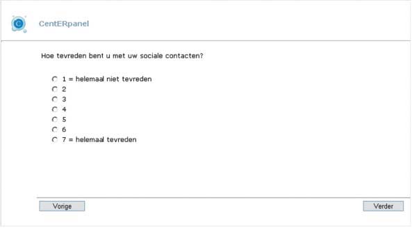
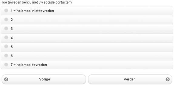
Computer and mobile versions of web surveys differ with regard to a few fundamental functional choices. Designed for computers, the regular web layout presumes large screens with mouse handling and typically has fixed parameters such as font and button sizes. Mobile web surveys, on the other hand, are designed for fingertip navigation on small to average screens and apply flexible font and button sizes which respond to the screen size. Further, implementation choices such as avoiding long horizontal answer scales (Stapleton 2013), presenting question items on individual screens, and limiting the question wording make a survey further suited to small screens. A comparison of the two layouts is presented in Table 1.
When actively designing a multi-device online survey, one commonly takes the standard computer-web design as the starting point and adapts it to mobile devices. Creating two separate versions of a questionnaire may, however, require considerably more development and testing time. Different layouts might also affect the response behavior, although comparisons between computer and mobile web surveys have shown very few differences in survey results or data quality (de Bruijne and Wijnant 2013; Mavletova 2013). Lower response rates and longer completion times in mobile web surveys have been reported, but these differences may also be due to device difference rather than layout.
There is another approach to offering a web survey via both computer and mobile browsers which has scarcely been investigated. Instead of adapting the layout for each device separately, one layout could be optimized to be compatible with different types of online access. As the screens of mobile devices are smaller than computer screens and navigated using fingers instead of the more precise mouse, they represent more restrictions for survey presentation than computers. The most feasible option for a multipurpose design would seem to create one based on this most restricted environment, which is then also applied to the more advanced environments.
Moreover, it is not known whether the regular web survey layout works inherently better as an input interface than the recently developed layouts for mobile touchscreen interfaces. For example, the relatively large buttons of the touchscreen layout could be an easy-to-use alternative on computer screens as well, especially for those who are less able to pinpoint small radio buttons. Therefore, research is needed to evaluate whether the mobile web layout could be applied to computer web surveys as well. Another important incentive to explore this approach is that the functionality of computers is moving toward touchscreen devices as some laptops are already being equipped with touchscreens.
Methods
We conducted an experiment in the CentERpanel, a probability sample of households which forms an appropriate estimation of the Dutch-speaking population in the Netherlands. The panel is composed of over 2,000 households which complete web surveys every week. Since not all Dutch people have computers, those households that do not have a computer or Internet access are provided with one to avoid sample bias.
On August 9, 2013, we fielded a questionnaire in the panel to investigate the effects of administering a survey with a mobile web layout. The survey consisted of ten 7-point scale items on social satisfaction, followed by survey evaluation items. All panel members aged 16 and older were invited to participate. Prior to the field work, the sample was split into two random groups. One group was allocated to a regular, computer web version of the questionnaire, with the standard panel layout. Another group was allocated to a survey version which was especially designed for mobile devices and touchscreens. Both questionnaire versions could be opened with regular and mobile web browsers. In Figure 1, examples of both layouts are presented. Using the example of Millar and Dillman (2012), we encouraged respondents using mobile devices in the mobile layout condition to inform the respondents about this possibility and to investigate whether this might stimulate mobile response.


The touchscreen design was developed using the C-MoTo style sheet, a mobile touchscreen interface for Blaise IS questionnaires based on jQuery Mobile. The interface makes use of the most common mobile touchscreen features such as relatively large font size and large buttons for answer options.
The questionnaire consisted of ten items on one’s perception of his/her neighborhood. The items had 7-point answer scales which were presented vertically. Only one question was shown per screen. In addition, the respondents were asked to evaluate the user-friendliness of the layout at the end of the questionnaire. This could be reported by four usability items with 7-point scales, measuring completion comfort, ease of use, whether other people would quickly learn to work with the layout, and professional impression. We also registered time stamps and user agent strings.
Results
The response rates were almost identical in both regular (71 percent) and mobile web layout conditions (72 percent), and reflected the typical level for the panel (see Table 2). There were virtually no break-off respondents (regular: four respondents and mobile: three respondents). It did take slightly longer for the respondents to complete the mobile web layout version of the questionnaire.
Providing a special design and prompting mobile device usage did not result in more response using smartphones or tablets. In fact, contrary to our expectations, the rate of using mobile devices with the regular web layout was unexpectedly higher (17 percent) than in the mobile web condition (13 percent) [χ2 (1, n=1,961)=4.37, p=0.04]. We checked that there were no significant differences between the conditions by age, sex, or education level.
When comparing survey means by condition, only two out of ten items resulted in significant differences (see Table 3). There were no differences in the frequency of selecting first or last answer options, implying a lack of response order effects by layout. No significant differences in answer distributions could be found on 0.01 level and only one on 0.05 level (χ2-tests, results not shown). Altogether the different layouts appear not to lead to differences in survey results.
We also compared the results within condition by the device which was used to complete the survey, and between conditions within these device based subgroups. It should be noted that the subgroups were self-selected. We found, however, few significant differences by used device.
Overall, the respondents were less satisfied with the mobile web layout than the regular web layout (see Table 4). When comparing the survey satisfaction between respondents who had used a computer and those who had used a mobile device to complete the survey, the results show that mobile users were clearly more satisfied with the mobile version than the PC users. However, they rated the mobile layout significantly better than the computer layout on only two of four factors, namely the ease of use and learning speed.
When the respondents were asked for suggestions to improve the mobile layout, features such as the color of the survey were often mentioned, as well as the fact that the font was too large or the elements were too widely spread on larger screens.
Conclusions
Web surveys are currently either provided “as is” to all online respondents or, increasingly, adapted for mobile devices. An experiment with an alternative approach, offering a survey with a mobile web layout to the whole web sample, shows that this approach has no effects on the survey outcomes when regular scale items are used.
The layout change on computers does, however, come with the costs of a decrease in survey satisfaction. As Couper (2013) suggests, the fundamental question with mobile data collection is not what is possible, but what the respondents are willing and able to do. There is no technical reason why traditional web survey design cannot adopt features applied in the mobile environment. The main challenges lie in user perceptions. By making survey layout responsive to screen size on computers, font and buttons may become awkwardly large or widely spread on very large screens. Defining a maximum size for the survey window on computers could be one solution to this, but it will take more overall research into the user experience before mobile web survey layout can be applied for computers. Learning from this experiment can nevertheless be a step toward a more advanced survey design in which the best of touchscreen layout is integrated with regular web layout.
Discussion
While our experiment contained only regular scale items, more research would be needed on comparing the layouts with other question types and different lengths of question text and answer scales. When using large amounts of text or very long answer scales, the limits of visible screen size are reached sooner with the mobile layout than with the traditional web layout.
Finally, when actively designing a multi-device, multi-browser survey, there are two strategic approaches to follow. One can attempt to optimize the survey layout for each type of device separately, or one can pursue a universal, multipurpose survey layout suited for all devices. To arrive at the ideal online survey design requires further research into both strategies. Our experiment already showed that, for regular question items, there should not be a difference in survey results if a mobile layout is used for both mobile and web users, instead of the traditional web layout. This approach brings the practical advantage of being compatible with all most common online devices while requiring less survey development time than multiple survey versions. If the perceived design can be improved such that the respondent satisfaction meets that of the web layout, this approach provides a new strategic choice to seriously consider for online surveys.