It is another ordinary day at the survey research center, and a Web survey designer is drinking coffee while reading over a request for a proposal to conduct a Web survey. The request states that because the sponsor is a U.S. Government agency, the Web survey must be accessible and must conform to Section 508 of the Americans with Disabilities Act.
Conformance with Section 508 is an unfamiliar requirement, so the Web survey designer investigates by typing “Section 508” in the Google search window. The first ten of 13.8 million results appear. The results page offers some links which reference the standard and others that provide checklists. The designer needs to understand this requirement before the survey research center can bid on the task, let alone conduct the survey if their bid is accepted.
Defining Accessibility
The core principle in creating accessible and usable software for persons with disabilities is equivalent access. Information must be accessible to all users. This does not mean equal access. For example, when some software is installed, sighted users will see a progress bar moving to the right with a percentage value being updated continuously until it reaches 100%. A person with a visual deficit using a screen-reader would hear an announcement every few seconds about completion status – “50 percent complete … 80 percent complete.” Information about installation progress provides constant updates to persons who can see, but periodic updates to screen-reader users because progress changes faster than it can be announced. Similarly, images can be made accessible by creation of a short text description known as alternate, or ALT, text. Therefore, a screen-reader announcing progress toward installation completion and reading image ALT text satisfies the requirement for equivalent access.
The Regulation Versus the Intention of Section 508
Accessibility is not a new requirement and has been a U.S. Government regulation since June 2001. Automated accessibility testing tools are available. Free tools like Cynthia Says test just one page at a time. Tools such as AccVerify and InFocus can check entire Web sites and must be purchased.
Since future work for the U.S. Government will require accessible software, the Web survey designer decides to invest in an automated testing tool. The next question is how to interpret the results. The output of the tool lists accessibility violations and provides the line number in the code where the violation occurred. As the Web survey designer reads about using the automated tools, the literature indicates that such tools will interpret each and every accessibility guideline literally, without consideration to what else is on the page (Moss 2007). The designer gets the feeling that these tools do not exhibit a lot of common sense.
A Web application may be coded perfectly and conform to a strict coding structure, but if the content is poorly structured, the software will be difficult or impossible to use for persons with visual deficits. Content structure is the most important part of accessibility. It is possible to create an application that will pass the automated accessibility tests, but be unusable and therefore inaccessible.
Windows PC users who are blind or have low vision often use screen-reader software, either Window-Eyes from GW Micro or Job Access With Speech (JAWS) from Freedom Scientific. Screen-reading software permits users to hear text content of Web pages and Windows applications. Web survey designers need to realize screen-reader users will require more time than mouse users do to access form fields, questions, and navigation buttons, and that screen reader users can only manage large text blocks if sections are marked with text headers. For screen-reader users, making sense of unstructured text is like trying to drink water from a fire hydrant with a straw – there is just too much information.
The Top 5 Accessibility Issues
During a five year period (2004–2009), the author reported on accessibility issues for software applications submitted to the Usability Lab in the Statistical Research Division at the U.S. Census Bureau. Navigation problems accounted for fourteen percent of the accessibility issues; these navigation issues were divided between incorrectly programmed tab order and problems with skip link navigation, which is used by screen-readers users to bypass groups of repetitive links to access content quickly. Fifty-four percent of the accessibility issues were related to missing or incorrect text. Web survey designers must create meaningful ALT text for any graphic; ensure plain text is accessible and not an image of text; and use descriptive labels for data-input fields. If ALT text, plain text, and labels are accessible on a Web survey form, then it will be possible for a screen-reader user to complete a Web survey.
Types of Web Surveys
Web surveys may be implemented in one of two ways: screen-based or scrolling/paging. A screen based form has one question per screen. The user navigates by using previous/next buttons. The second method is a scrolling or paging implementation, in which all questions are on one page, and the user navigates by scrolling up or down the form. Either implementation method can be made accessible, but a screen-based form has the advantage of delivering text in more manageable blocks, and providing the Web survey designer the benefit of using a question response to customize the phrasing of any following questions. For example, on a screen-based form, if a respondent answers all children living there are in boarding school, later questions about them using the public bus to get to school could be skipped.
Usage of Color
Paragraph I, 1194.21 of Section 508 states: “Color coding shall not be used as the only means of conveying information, indicating an action, prompting a response, or distinguishing a visual element.” Therefore, color alone cannot be used to specify an action or convey any information required by a user to accomplish a task. For example, if a screen has a light green button labeled with “GO” in dark green text, instructions must not rely on color. Since users with a color deficit see in shades of gray, a statement like “Press the green button” would not help the user accomplish the task. Instead, instructing the user to press the GO button makes it possible for persons with a color deficit to successfully complete the task.
Visual Focus and Reading Order
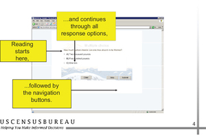
Screen-reader software will vocalize text beginning on the upper left part of a screen and proceeding down to the lower right, following the visual reading order. Reading order may be modified by changing tab number values so text can be read down two adjacent columns (column 1, then column 2) instead of left to right and top to bottom. Reading order may need to be modified to match the visual order. As a user tabs through the interface, the application must show visual focus, per Paragraph C, 1194.21 of Section 508. Visual focus is accomplished by showing a box around a screen element that moves to the next element when the tab key is pressed.
Screen-reader users must navigate backward to hear content on the top of a screen and forward to access content towards the bottom of a screen. For this reason, persons using screen-reader software are said to have linear access. Mouse users have random access because they can click on any screen element immediately without needing to step through other areas on the screen.
Memory Burden
Access to application: screens presents a greater memory burden to screen-reader users than to persons with normal vision because information preceding or following the current cursor location is not immediately available. More text present on the screen requires more time to navigate to the relevant text, such as a question, and raises the risk a screen-reader user may forget the question when accessing the data-input field. Questions should be structured to accommodate short-term memory issues. Unless the material is transferred to working memory, the first items mentioned tend to be the first items forgotten (Peterson and Peterson 1959). Sighted users do not have this problem because they can scan back to instructions easily.
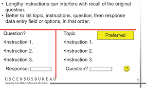
Placement of Instructions: On the left side of Figure 1 the question is listed first, followed by instructions, then a response field. The right side of Figure 1 contains a topic phrase to set up context for the directions, which follow next, after which the question and a response options area are provided. Lengthy instructions can interfere with recall of the original question. Screen-reader users will likely have better success in remembering the question if there are no instructions between the response field and the question.
Stem-and-Leaf Structure: Screen-reader users may find questions using a stem-and-leaf structure challenging to comprehend. A question stem contains the first part of a question, followed by two or more conditions (the second part of the question) called leaves. Listening to the first leaf does not present a problem because it follows the stem. The issue arises if a screen reader user is positioned on the second and later leaves and cannot remember the stem text; then backward navigation is needed to hear the stem text again. Stem-and-leaf structures are technically accessible, but have poor usability.
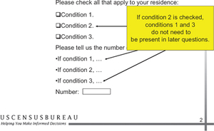
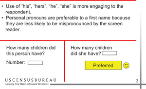
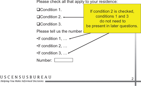
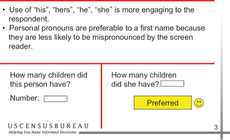
Inferences and Memory Burden: Inferences can be used to streamline a Web survey questionnaire. The amount of text and user burden could be reduced if question wording is inferred from earlier responses. Figure 2 shows that if a respondent chose condition 2, they should not hear instructions for conditions 1 and 3 in the following question. Figure 3 demonstrates that inferences can also be used to make Web surveys less impersonal. If gender is asked, this information could be used to word later questions with personal pronouns (he, she, his, hers). Mispronounced words, such as first names, may cause screen-reader users to back-track to hear the name again, so personal pronouns are preferable to first names because they will not be mispronounced by the screen reader.
Navigation Instructions
Web survey designers must consider the differences in perception between screen-reader users and persons with normal vision. Specifically, in the case of screen layout, an instruction contained in a column that tells users to choose a link to the left or right poses a barrier to screen-reader users. While the link appears visually to be a short distance away from the instruction on the screen, the screen-reader user must first guess which direction to navigate, then press the tab key a number of times to access the link. This situation can be avoided if a link always immediately follows the direction to select it in the tab order. If a link is accessible, a direction to “select the link below” usually will not pose problems for screen-reader users because they can infer they must navigate forward to access the link.
Testing Methodology
Automated accessibility testing on a Web survey should be performed on a Windows PC with speakers. Testing tools and screen readers are available for other operating systems, but Windows users dominate the market. Unless the Web survey is a scrolling form, it is likely that only one screen can be tested at a time. The automated accessibility testing software does a good job at identifying missing labels for graphics and buttons but does nothing to check for a logical tabbing order or whether the ALT text for a graphic makes sense.
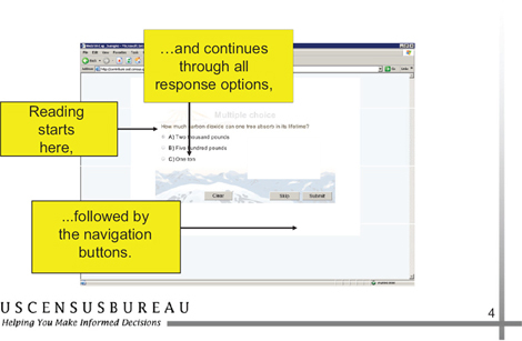
An example showing correct reading order is provided in Figure 4. Tabbing order and readability are best checked with a screen-reader. The tester should obtain a free demo copy of either the Window-Eyes or JAWS screen-reader. Launch the Web survey, start the screen-reader, and begin tabbing through the survey. Check the text between headers and buttons with the up and down arrow keys. The demo software runs for 30 minutes (Window-Eyes) or 40 minutes (JAWS) before the tester must reboot the PC.
Recommendations for Accessible and Usable Web Surveys
Make it usable – Usability testing needs to be done with test participants performing typical tasks, and any issues that are observed during testing need to be corrected. The Web survey should be easy to use and allow users to provide their information accurately and efficiently, with high satisfaction. Minimize memory burden, and avoid stem-and-leaf questionnaire structures. Remember: If it’s not usable, it’s really not accessible. The Web site usability.gov offers guidance on creating usable software.
Make it accessible – An automated accessibility testing tool and screen-reader software should be used to evaluate the Web survey for conformance to Section 508 and to assess equivalent access. Color should not be used alone to convey information. Software applications must adhere to Section 508 Web guidelines to be accessible.
Ensure correct reading order – The screen-reader user must experience the same visual sequence of questions, answer choices, skip patterns and instructions as that experienced by the sighted user. Does the text read in the same order when accessed by tabbing/arrow keys as a sighted person would read it? Does the application show focus (a box around a screen element) when the tab key is pressed? Even though a questionnaire screen may appear to be laid out properly, the text still may not be read aloud in the correct order by screen-reader software. Screen elements are automatically assigned a tab number when they are placed onto an application page, which may not coincide with the visual reading order. Web designers can revise the tab order with their development software to ensure the correct reading order. Jim Thatcher and WebAIM both offer guidance on Web form layout.
Create a single accessible version – It is more efficient to create one accessible application rather than two versions, such as “text only” and “graphical (point and click)”. Frequently, “text only” versions of software are not updated when the graphical version is modified. A text alternative should only be considered as a last resort and should be updated whenever the graphical version changes.
Integrate accessibility into the design process – Accessibility should be part of the design process from the beginning. Adding in accessibility in the final stage of development can be costly and is not always possible. Design modifications for accessibility should occur at the beginning of the process before programming begins when changes are easier to make.
Summary
There is much for Web survey designers to keep in mind when designing surveys to be Section 508 compliant. It is important to remember that accessible text does not guarantee a usable interface for screen-reader users; unstructured questions can cause an undue burden on short-term memory, but this burden can be minimized by avoiding stem-and-leaf questionnaire structures and using inferences to reduce wordiness. Additionally, problems screen-reader users experience with navigation can be minimized if the programmed tab sequence follows the natural reading order (top to bottom, left to right). Also, although automated accessibility testing software identifies missing labels for graphics and buttons, tabbing order and readability are best checked with screen-reader software. Finally, it is more efficient to create and maintain one accessible Web survey from the beginning of the design process rather than separate text and graphical versions. If a Web survey is accessible and usable, then all users will be able to respond to Web surveys with greater accuracy, ease and satisfaction.
