In many Web surveys, respondents navigate through the instrument using Next and Previous/Back buttons. There is considerable variation in practice and discussion among researchers about where to place these buttons and how best to design them to encourage the desired behavior. We conducted an experiment on the placement and design of these buttons. We find significant effects of these factors on completion time and use of the Previous button, but not on breakoff rates. We discuss the detailed results and implications for practice.
By far the most popular Web survey design is one in which the questions are presented in a series of pages, typically with one or more questions per page. In such instances the designer is faced with a variety of possible options to facilitate or control navigation through the instrument. The basic actions of interest to us here are moving forward in the instrument (variously labeled “Next,” “Forward,” “→,” and so on), moving backward (using a button labeled “Previous,” “Back,” “←,” and the like), and stopping or suspending the survey (labeled “Stop,” “Save,” etc.). Other optional buttons or hyperlinks permit the respondent to get additional information, provide a comment, seek additional information about the study, etc. In establishment surveys (and some household surveys), additional action buttons may permit respondents to suspend and resume, print the questionnaire, check calculations, view previous submissions, and so on. We are primarily interested in the basic navigation functions to move forward and backward through the instrument. For the sake of convenience, we will refer to these as Previous and Next.
Even within this narrow focus, there are a number of different design choices, and considerable variation exists in the functions made available to respondents. For instance, market research surveys sometimes permit forward movement only, that is, they prevent respondents from moving backward. Some designs also do away with the Next button for single response options, and use auto-advance to deliver the next page immediately upon making a choice (clicking a radio button) on the current page (see Hammen 2010; Hays et al. 2010; Rivers 2006). Even in such surveys, a Next button is needed for multiple response (check-all) questions or those requiring entry into a text field.
Assuming a design where the respondent is able to control navigation, the goal of good design is too facilitate the task of the user – that is, to help the respondent move through the instrument as efficiently and effortlessly as possible, without interfering with the primary task of answering the questions. Furthermore, the design and placement of the action buttons should encourage the desired behavior of moving forward in the survey, while still permitting going backward if desired. In other words, the Next action is the preferred but not required action.
How can the placement or location of the action buttons facilitate the preferred action? What mental model do respondents bring to completion of Web surveys? There are several arguments for placing Next on the right of the page, and Previous on the left (see top right panel of Figure 1). Web browsers, Google search results, and many other Web applications have the Previous button on the left and, when appropriate, the Next button on the right. This same configuration is used in most direct-manipulation electronic devices (e.g., TV remote controls, DVRs, etc.). The Kindle and iPad both use this approach for paging through text or Web pages. However intuitive this approach is, there are several potential drawbacks.
.jpg)
One drawback is that while all of the above devices have a fixed configuration (i.e., the location of the buttons does not move), in standard Web browsers, the size of the browser window can vary, sometimes moving the Next button away from the visual field, especially if the survey questions are left justified and aligned vertically. Another is that respondents have to select a response then press Next. This requires moving the mouse from the left of the screen to the far right. Fitt’s (1954) Law suggests that the time to acquire a target (e.g., click Next) is a function of the distance to and size of the object (see Schneiderman 1992, pp. 153–4). This suggests that the further the Next button is from the answer choices, the longer it would take for respondents to select it, thus arguing for placing the button as close to the response options as possible.
A third possible drawback of placing Previous on the left and Next on the right relates to the default tab order of objects in HTML (see Crawford et al. 2003). After selecting a response, most browsers will automatically activate the following button in the tab sequence. With Previous on the left, this would be activated, which means that if a respondent pressed “Enter” after a selection, they would go backward rather than forward. In their design guidelines, Crawford et al. (2003) recommend placing Next on the left (as in Figures 1–2).
One final argument for placing Next on the left is that this follows the Windows convention of placing the most frequently used functions on the left of the menu bar. For example, “Save” or “OK” is often on the left while “Cancel” is on the right (see Ferrell 2009). The U.S. Health and Human Service’s (2006, p. 133) guidelines for Web site design include the following recommendation: “If one pushbutton … is used more frequently than others, put the pushbutton in the first position. Also, make the more frequently used button the default action, i.e., that which is activated when users press the Enter key.”
In summary, two conflicting sets of design principles could be invoked, one that argues for Next on the left, and the other for Next on the right. Which of these is preferable for Web surveys, or does it not matter? In other words, do respondents easily adapt to either configuration?
Regardless of the location of the buttons, the design of the buttons may also have an effect. For example, Wroblewski (2008), who argues for placing the most-used button on the left, found that website users performed best when 1) the primary buttons (e.g., Submit) and secondary buttons (e.g., Cancel) were visually distinguished from one another, and 2) the primary and secondary buttons were presented close together rather than far apart. The issue of tab activation order could be addressed by placing Previous below (rather than to the right) of Next, or by using a hyperlink rather than an HTML button.
Prior Research
The question of action button placement and design has received relatively little attention in survey research. In an early unpublished study conducted in 2003, Baker and Couper (2007) varied both the location of the action buttons (Next on left versus Next on right) and the design of the buttons (words versus arrows). They found that placing Previous on the left significantly increased its use (mean of 0.97; 46.2% ever used) relative to placing it on the right (mean of 0.76; 40.1% ever used). However, they found no differences in the actual or perceived completion time of the survey, or in breakoff rates. Furthermore, the use of arrows or words had no effect on the use of the buttons, completion time, or breakoffs.
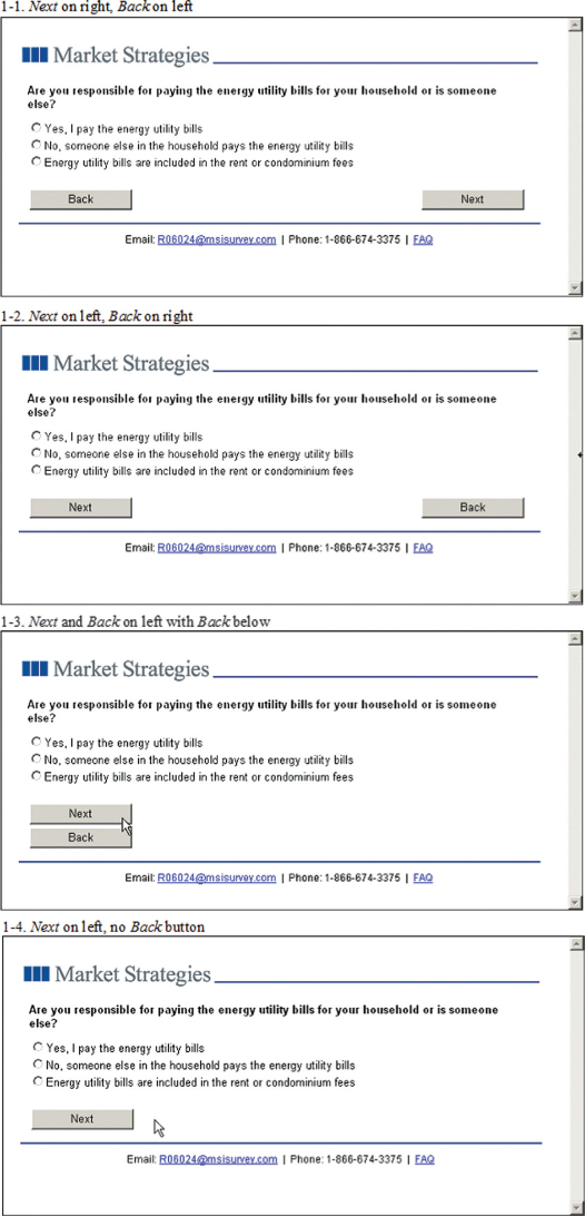
In a follow-up study, Baker and Couper (2007) varied 4 conditions: 1) Next on right, Back on left, 2) Next on left, Back on right, 3) Next and Back on left with Back below, and 4) Next on left, no Back button (see Figure 1). They found that removing the Back button significantly increased breakoffs (15.7% with no Back button, 12.3% with Back button, p<0.05). They found no significant differences in breakoff rates among the other conditions, although there were fewer breakoffs (10.7%) when Back was below Next, than Next on the left (12.6%) and Next on the right (13.5%). Placing Back on the left (and Next on the right) significantly (p<0.05) increased its use (mean=0.69) relative to Back on the right (0.48) or below the Next button (0.31). Survey completion time was also significantly longer with Next on the right than on the left (16.1 versus 15.2 minutes, p<0.01).
These earlier studies suggest that the presence of a Back or Previous button is important in reducing breakoffs. In terms of placement of the buttons, the differences in breakoff rates and completion times are small. Placing Back on the left marginally increases its use, but the results suggest that this may occur on the first few screens and that respondent quickly adjust to the placement of the action buttons. Given these results, we designed another study to explore both placement and design of the Next and Previous buttons, testing ways to minimize visibility of the Previous button while still making it accessible to respondents. Specifically, the study was designed to extend previous work and explicitly test Wroblewski’s (2008) finding that user performance is improved when 1) the primary (e.g., Next) and secondary (e.g., Previous) buttons are visually distinct, and 2) the primary and secondary buttons are presented close together rather than far apart.
Design and Data Collection
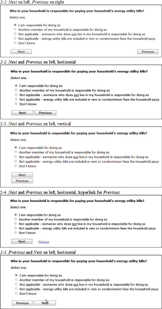
We varied the order, position, and visual distinction of the action buttons across five different conditions:
-
Next on left, Previous on right
-
Next and Previous on left, horizontal
-
Next and Previous on left, vertical
-
Next and Previous on left, horizontal, hyperlink for Previous
-
Previous and Next on left, horizontal
These are shown in the above order in Figure 2. Note that our goal was to extend – rather than simply replicate – the earlier findings, so we did not include a condition that reverses the position of the two buttons in condition 1 (i.e., the top left condition in Figure 1). However, we can compare conditions 2 and 5 to examine the order of action buttons. Based on the earlier studies, we expect condition 5 to exhibit increased use of the Previous button and longer completion times than condition 2. Based on Wroblewski’s (2008) work, we also expect that placing the buttons closer together (as in condition 2) would improve performance (i.e., reduce breakoffs, use of Previous, and completion time) relative to having them further apart (as in condition 1). Using a similar argument and outcomes, we expect the vertical orientation (condition 3) to improve performance over condition 1, and reducing the visual prominence of the Previous button (as in condition 4) to improve performance further.

The experiment was embedded in a survey of attitudes on energy-related issues (virtually identical in content to that used in Couper and Baker 2007). We purchased sample from three different online panel vendors. All three use non-probability recruitment methods, but with variation in how members are recruited. We tested whether the source of the sample had any effect on the experimental results and as they did not, we combine the results from the three sources. Similarly, the study also included an experiment on dealing with missing data (requiring answers versus offering an explicit “don’t know” option; see Couper et al. 2010). Again, as the results of the two experiments did not interact, we focus on the main effects of the action button experiment here.
Response rates cannot be computed across the three sample sources, as the denominators are not known. We requested a total of 1,800 completes, with 600 from each vendor. Eligibility was restricted to adult (18+) residents of the United States. A total of 1,898 eligible persons began the survey, and 1,720 completed it, for a completion rate of 90.6%. This is not a probability sample, but a large and diverse group of volunteer subjects in an experiment.
Results
We examine a variety of different outcomes across the five conditions, as well as examining the planned comparisons outlined above. Table 1 includes some key outcomes across the five treatment conditions. First we look at breakoff or termination rates across the conditions. We find no significant differences in breakoff rates across the five conditions (χ2[4]=2.05, p=0.073). We expected that placing Next and Previous closer together (condition 2) would improve performance relative to placing them further apart (condition 1). The breakoff rates show a slight trend in this direction (8.2% versus 10.1%), but this difference does not reach statistical significance. Unexpectedly, arranging the buttons vertically (condition 3) has the highest rate of breakoff, but again this does not differ significantly from the other conditions.
Turning to completion time, the overall effect of the treatment on completion time is not significant (F[4, 1715]=2.07, p=0.082). Again, contrary to expectation, we find no advantage in terms of completion time of placing the buttons closer together rather than further apart (condition 2 versus 1). We do find some support for making Previous less visible by placing it below Next (condition 3) or making it a hyperlink (condition 5), associated with faster completion times. However, contrary to expectation, condition 5 is also associated with faster completion times than either condition 1 or 2. We thus find only mixed support for our expectation in terms of completion time.
We explored whether the differences in performance may wash out as respondents become familiar with the placement of the action buttons. We compared time across the first 5 items, and across the first 10 items, to see if this was the case. We find no evidence of significant time differences across the first few items (not shown in Table 1).
Our next variable of interest is the use of the Previous button. Here the goal of design is to minimize the use of the button (i.e., to discourage respondents from backing up in the instrument other than to intentionally review or change a response). First, we see significant differences in the proportion who ever use Previous across conditions (χ2[4]=90.21, p<0.0001). About one in five respondents back up at least once in the first two conditions, while less than one in ten do so in each of the remaining conditions. As expected, reducing the visual prominence of Previous (by placing it below Next or using a hyperlink) reduces its use relative to a horizontal layout. However, condition 5, in which Previous is to the left of Next also shows lower use relative to placing it on the right (conditions 1 and 2). This seems to suggest that user expectations of Previous on the left and Next on the right may trump the visual proximity argument. Similar effects are found when looking at the mean use of Previous (also shown in Table 1).
While these rates suggest that the Previous button is used infrequently (an overall mean of 0.65%, or less than one use per hundred pages), there are some substantial outliers, with one respondent using the button on 55% of the possible occasions. We dealt with this skewed distribution in two ways. First, we truncated the distribution at the 99% percentile (1.07%) and re-examined the rates – the relative order of the different treatments did not change. Secondly, we ran a Poisson regression on the raw counts of Previous button use, again finding a similar pattern across the 5 conditions.
We expected that the use of Previous may occur more often in the first few questions, until respondents get used to the placement of the buttons. The use of Previous was spread quite uniformly across the entire instrument, and we see no discernible patterns in early versus late use.
Finally, we hypothesized that items presented horizontally in grids would move respondents’ eyes to the right of the page (where Previous appears in condition 1). The last two rows of Table 1 show the rates of Previous button use for grid and non-grid pages, respectively. Use of Previous is higher in grid items (2.55%) than in non-grid items (1.07%) when the button is on the far right (condition 2), as expected. However, a similar pattern also emerges for condition 2 (2.04% for grids versus 1.30% for non-grids), where Previous is on the left, following Next. Thus, we see only mixed support for our expectation regarding grid items.
Finally, we tested interactions of the action button placement with several other variables (panel source, frequency of Internet use, age, and education) on both completion time and on use of the Previous button. We find only one statistically significant interaction (with age on rate of Previous button use), but this effect is not readily interpretable, and the differences are small.
Discussion
Our manipulation of the placement and design of Next and Previous buttons had little effect on breakoff rates or on survey completion times. The design manipulations did, however, have an effect on the use of Previous, but not in a way consistent with our expectations. Further, the effects of the button placement partly depend in turn on how the questions are presented on the page – whether vertically on the left or horizontally using the full width of the page.
We find some support for placing Previous below Next (which address the tab order issue) or using a hyperlink (which reduces the visual prominence of the option, both in terms of completion time and use of the Previous button). The placement of Previous on the far right of the Web page – consistent with the Crawford et al. (2005) recommendation – did not show the advantage found in earlier studies, where Next was placed on the far right of the page (we did not include that condition in the present study).
Our study suffers from a number of limitations. A key limitation is that this experiment was conducted with a group of volunteer opt-in panel members. These respondents are likely to have considerably more experience completing online surveys than the general public. This could have effects that go in different directions. First, they may have become inured to the variations in survey design within and between panels[1], thus attenuating the effects of design differences. Second, they may be familiar with a particular design (e.g., Previous on the left, Next on the right) that may exaggerate the effect of observed differences in design. Would we find bigger or smaller effects among relative survey novices than among the veteran survey-takers we studied?
Another limitation is that we did not capture client-side paradata (Heerwegh 2003) in this survey. This would have allowed us to explore whether the Previous button use resulted in changes of answers on earlier questions, providing some evidence of whether these are accidental or deliberate uses of the button to review and/or change a previous response. The goal of good design should be to eliminate or reduce the former but not the latter.
In summary, what do we make of these findings? Is this something we should pay attention to, or is this all “Much ado about nothing?” Our findings suggest that design decisions like those we studied do indeed have an effect on how respondents navigate the survey. They also suggest that experienced users quickly adapt to variations in design. They may also suggest that what may be optimal from a design perspective may not always work best, because respondents may be used to doing things a particular way. Testing the effects of these manipulations on less-frequent survey-takers may be worthwhile. However, for other settings, we recommend that survey designers consider the use of a hyperlink for the Previous or Back function, or place the Previous button below the Next button, either centered (if the questions are centered on the page or the majority are presented horizontally) or on the left (if most of the questions are presented vertically and left-justified). Finally, it seems clear that a Previous button, regardless of design and location, is something that respondents expect and including one is always a good idea.
Some panel vendors control the design of their surveys, while others pass respondents on to third-party sites, where the designs may vary. Moreover, membership in multiple online panels is common.